The Redskins’ attendance woes have been well-documented over the last year and change. In 2018, they suffered the largest-ever decline in average attendance (19%—second-worst was 9% in 2018). They did away with the “waiting list” for season tickets. Nobody wants them! And this season’s 0-3 start isn’t going to right the ship. It’s time for Head Coach Jay Gruden—and the entire staff—to get the long overdue boot.
I can’t contain my frustration with the team. Can you tell? From the fan’s perspective, there’s almost nothing to be happy about. But from my entrepreneurial perspective, I’m mustering up all of my positive energy to give love to the person within the Redskins organization responsible for making their Facebook and Instagram ads.
Using Facebook’s Ad Library, I can see all of the Redskins Facebook and Instagram advertising efforts. I can’t see how well they’re converting—I’m assuming not nearly as well as they would if fans had an ounce of hope. But I digress.
In general, I advise business owners to “get their ducks in a row” before pouring money into advertising. If you’re disorganized, if your product or service branding isn’t polished, you’re automatically less efficient with your advertising dollars and that inefficiency can be one hundred percent avoided.
However, in the Redskins case, when despite your terribleness you’re still considered the 5th most valuable NFL franchise, you have the budget and obligation to run advertising no matter how inefficient it might be.
Great ads can’t save a terrible product like the Redskins, but let’s take a look at why the Redskins’ ads are strong.
Experimenting with Ad Images
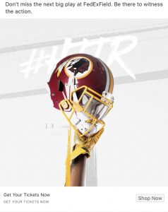

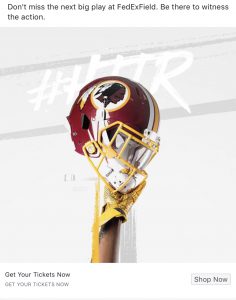
Take a moment to compare the three images above. Their differences may seem subtle and insignificant, but they’re not. The Redskins are doing what we like to call split testing. If you’re interested in learning about split testing in depth, our team highly recommends The Lean Startup by Eric Reis.
Each ad features the same text. The only thing different about the ads are the images. So, through these slight changes, the Redskins are learning what types of images their poor fans (me included) are drawn to most.
In my opinion, the most significant differences are in the image sizes. We use Facebook and Instagram on computers of various dimensions. Our computer’s dimensions affect how the ads look. Similarly, our phones vary in size, so the same logic applies.
Furthermore, we look at things in our News Feed, Stories Feed, Video Feed, etc. These feeds do not have the same dimensions. As a result, the performance of videos and images often varies by feed. I can guarantee that the Redskins’ performance reports for these ads highlight a handful of distinct strengths and weaknesses for each image version.
Experimenting with Ad Text
The Redskins deactivated their latest Facebook and Instagram Ads during the writing of this article. Once ads are deactivated, they’re no longer visible to the public through the Facebook Ad Library. I didn’t record the exact wording of their ad text variations before the ads disappeared!
My guess is that they’ll be cycling in new ads shortly—I doubt they’ve given up on running ads! Given the timing and focus of this article, them giving up would be be ironic, huh?
I thought it’d be helpful to re-share the text from the ads above:
Don’t miss the next big play at FedExField. Be there to witness the action.
Despite the lack of sufficient big plays and action in favor of the Redskins during games at FedEx Field, I like how this text is short and to the point. There was another version of text that was longer but in the same vein—unfortunately I can’t recall the exact details.
With multiple text versions, the Redskins can perform another split test to see if a certain style of messaging resonates with fans.
Using Dynamic Creative
I hope my explanation of different versions of ad text (more formally called ad copy) and images made sense. The more variations you have, the more difficult it is to keep track of them manually.
But Facebook and Instagram ads can use a tool called dynamic creative where Facebook’s artificial intelligence system will mix and match text and image combinations based on the feedback it receives from users. In theory, dynamic creative optimizes ads to feature the best combinations, making ads more efficient. The Redskins ads used this feature.
Conclusion
No matter your product or service, there are certain principles that you should follow in order to give your ad campaign the best chance at success. The Redskins follow them well yet—as you’re probably tired of me sharing—I still find their ads somewhat comical.
We’re 0-3. Watching today’s game isn’t worth the raised blood pressure it’ll cause. Ok, I’ll just watch the first quarter. Maybe the first half…#HTTR.
